Why Pantone Colours Matter in Packaging (And Why Your Logo Looks Different on Every Material)
Colour is one of the most powerful elements of brand identity — but it’s also one of the easiest to get wrong. If you’ve ever wondered why your brand red looks perfect on your business cards but suddenly appears dull on kraft paper, or why your supplier asks whether you want Pantone Coated or Pantone Uncoated, this guide is for you.
In premium packaging, colour accuracy isn’t optional. It’s the difference between “nice packaging” and “this brand knows exactly who they are.”
What Are Pantone Colours?
Pantone is the global colour-matching system used by designers, printers, and manufacturers to ensure colours stay consistent across every material and every print process.
Think of Pantone as the universal language of colour. Instead of saying “a bright blue,” you say Pantone 293 C — and every printer in the world knows exactly what that means.
Pantone is essential when:
- You need brand consistency
- You print across multiple materials (bags, boxes, tissue, labels, tubes)
- You want vibrant, accurate colours that CMYK can’t always achieve
- You use metallics, neons, or deep blacks
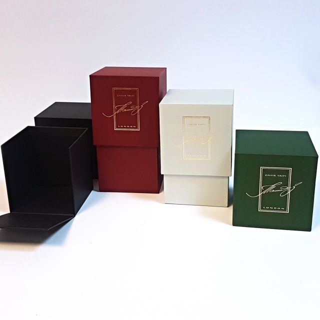
Pantone Coated (C) vs Pantone Uncoated (U)
Why the same colour looks different depending on the paper
Pantone colours come in two main versions:
- Pantone Coated (C)
- Pantone Uncoated (U)
They are the same ink formula, but the finish of the material changes how the colour appears.
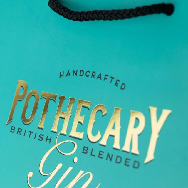
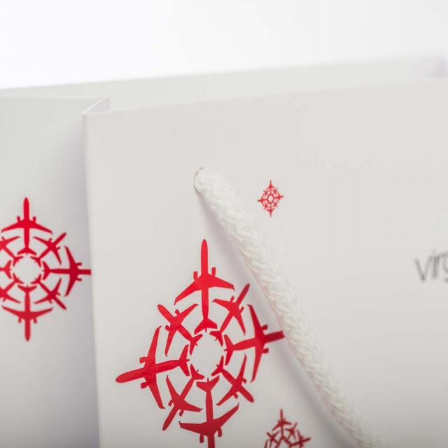
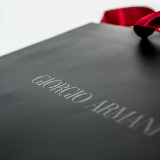
Pantone Coated (C)
Used on:
- Glossy paper
- Laminated boxes
- Coated artboard
- Stickers with a smooth finish
Appearance:
- Colours look sharper, brighter, more vibrant
- Ink sits on top of the coating instead of soaking in
Perfect for:
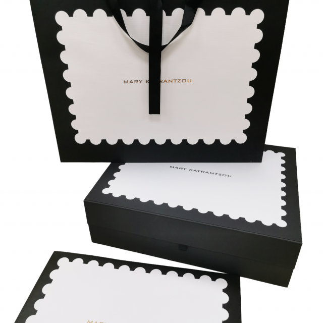
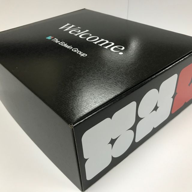
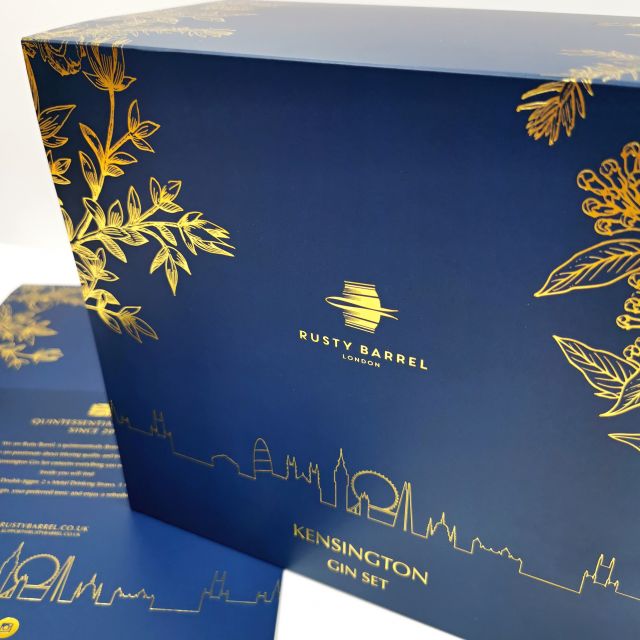
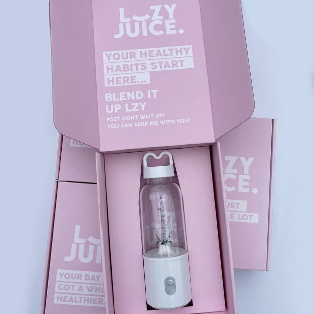
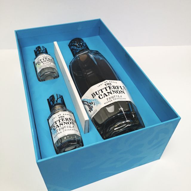
- Luxury gift boxes
- Retail packaging
- High-impact branding
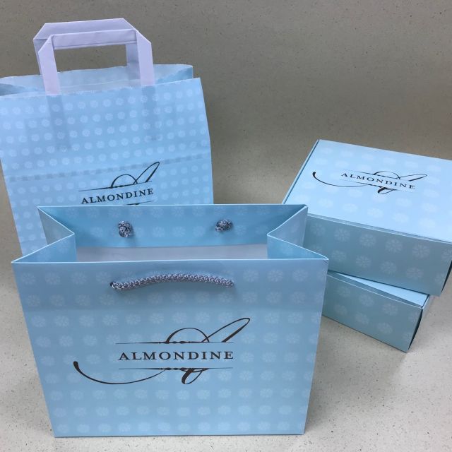
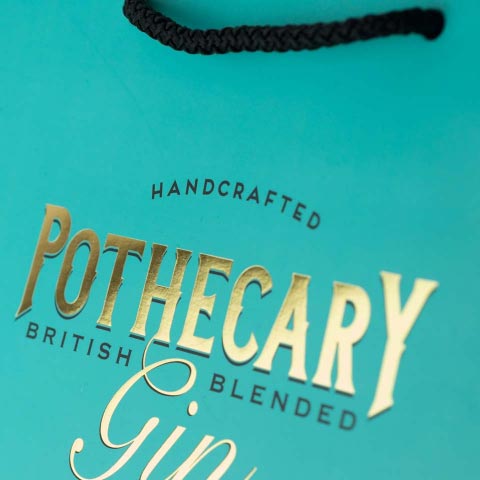
Pantone Uncoated (U)
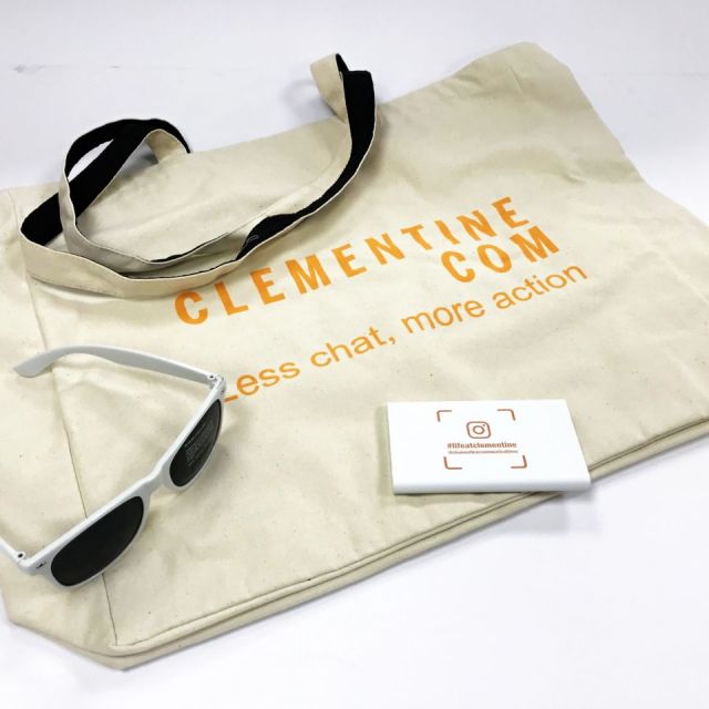
Used on:
- Kraft paper
- Tissue paper
- Uncoated swing tags
- Recycled or textured boards
Appearance:
- Colours look softer, warmer, more muted
- Ink absorbs into the fibres, reducing vibrancy
Perfect for:
- Eco-focused brands
- Natural, artisanal aesthetics
- Premium kraft tubes or bags
Why Colours Change on Different Materials
Even with the same Pantone number, colours shift depending on the substrate. Here’s why:
1. Absorption
Uncoated materials (kraft, tissue, recycled board) absorb ink like a sponge. Result: colours appear darker, duller, or more muted.
2. Surface Texture
Smooth surfaces reflect more light. Result: colours appear cleaner and more saturated.
3. Base Colour of the Material
White board vs brown kraft = completely different outcomes. Pantone Black 6C on white board = solid black Pantone Black 6U on kraft = greyish
4. Print Method
- Offset printing = most accurate
- Flexo = can appear grainier on kraft
- Digital = CMYK simulation, not true Pantone
- Screen printing = bold, opaque, great for bags and garments
Pantone vs CMYK: When to Use Each
Pantone (Spot Colour)
- Best for brand colours
- Perfect for logos
- Ideal for luxury packaging
- Consistent across suppliers
CMYK (Process Colour)
- Best for photography
- Good for multi-colour artwork
- More cost-effective for short runs
- Less accurate for brand colours
If your brand has a signature colour (Tiffany Blue, Coca-Cola Red, Harrods Green), Pantone is the only way to protect it.
Real Examples Your Customers Will Understand
- Your navy blue looks darker on kraft because the brown base absorbs the ink.
- Your gold foil looks different on matt vs gloss because of light reflection.
- Your brand red looks orange on tissue because tissue is semi-transparent.
- Your CMYK print looks different on every printer because CMYK mixes colours on the spot.
How to Choose the Right Pantone for Your Packaging
1. Always check both C and U versions
Your designer should specify both — e.g. Pantone 1525 C / Pantone 1525 U.
2. Request physical Pantone swatches
Digital screens lie. Pantone books don’t.
3. Consider the material first
Choose the Pantone that looks best on the substrate you use most.
4. Ask your supplier for a print proof
Especially for kraft, recycled board, or textured materials.
A Simple Cheat Sheet for Your Customers
- Luxury glossy boxes → Pantone Coated
- Eco kraft tubes → Pantone Uncoated
- Tissue paper → Pantone Uncoated (expect softer colours)
- Premium retail bags → Pantone Coated
- Recycled board → Pantone Uncoated (colours will mute)
- Metallics & neons → Pantone only